Try this Modern Variant of 'The World's Smallest Political Quiz'
A New Take on Nolan's Chart
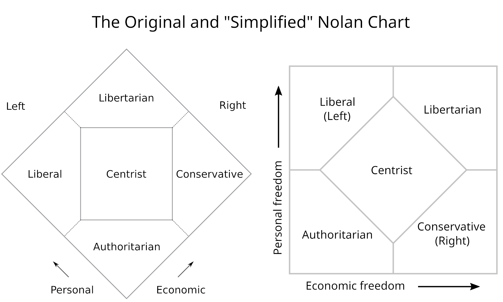
One of the most ubiquitous political tools, the Nolan Chart, which is sometimes called “The World’s Smallest Political Quiz” or the “political diamond”, is a staple of political self-identification that’s been taken tens of millions of times over its 57-year history. In that time, the tool hasn’t changed much except that it sometimes appears as a “simplified” square.
Nolan’s Chart has been forked by other projects such as The Political Compass and iSideWith.com, where the axes remain the same but with a slightly different visualization or alternative question lists. In this brief article, a potentially more relevant, if somewhat arbitrary, version of the chart is proposed and a live, interactive implementation of the quiz is provided for your entertainment.
One of the major criticisms of the chart is that it uses terms from politics and political philosophy like “liberal” and “conservative,” which are not perfectly aligned with greater or lesser freedom (either personal or economic). One example is Second Amendment rights, wherein conservatives favor less regulation and therefore more freedom, although the term “liberal” was traditionally associated with greater liberty (and remains so on other issues, like abortion or gender). One might add that almost no one self-identifies as “authoritarian”, even if the descriptor is accurate. Some have also argued that there’s an imperfect separation between “personal” and “economic” freedom, as issues like immigration or clean energy may involve both inseparably.
The proposed variant below attempts to address these shortcomings by not only updating the terminology and quiz questions but also by consolidating freedom into the vertical axis and using the horizontal axis to represent a preference for “velocity” of change. In order to preserve the alignment of political and directional left and right, I expressed this velocity as “resistance to change” ranging from radicals seeking major change now on the left end of the gradient to keepers of the status quo on the right.
It seemed to me that the horizontal gradient is relatively straightforward, whereas our all-encompassing freedom index on the vertical axis has a larger scope and is therefore more complex. For this reason, it did not seem important to allocate an equal number of questions to each of the axes. Instead, the preference for “velocity” of change is addressed with only two questions, which directly elicit the quiz-taker’s tempo1. The other eight questions cover personal, economic, and even technological freedom.
Although the political segments and axes above seemed to be the most relevant2 at the time of writing, you could readily create any number of other variations of the chart, all of which would have the potential to be equally or more valuable than this. This might be just relevant and interesting enough to justify answering the quiz’s ten simple questions. You can access the tool freely via this webapp and it will ask ten questions then show your results on a shareable infographic.
This “simplified”, or square, version of the chart is more appropriate in this paradigm because it more clearly depicts vanguard libertarianism as the “new Left” as is appropriate to a change-oriented high liberality group.
The ‘resistance to change’ (a.k.a. inverse velocity) questions probably need a little work. Currently there are ten questions in total, making this half as long as the original “World’s Smallest Political Quiz”. I may add-on one or two more questions to flush out the X-axis.
That I could think of offhand. I remain open to suggestions.


